branding – why red & yellow is used by the fast food industry

Karen Haller

When you think of red & yellow do any brands come to mind?... I'm guessing you thought of a fast food brand. That is because they predominantly used red and yellow? This isn't by accident. The feelings, the mood this combination of colours emits is perfect for their target market.
Looking at the positive psychology qualities of red & yellow in relation to the fast food industry, red is a stimulating colour that can trigger feelings of excitement which can raise the pulse rate. Red is also attention grabbing. Yellow triggers the feelings of happiness and friendliness.
When you combine red and yellow it's about speed, quickness. They want us in, eat quickly and out again.
Bright, vivid yellow is also the most visible colour in daylight, which is why the yellow of the McDonald's M can be seen from a far distance.
What is interesting to note is that the language of colour is communicated quicker to the brain than words or shapes as they work directly on our feelings and emotions. So we are already having an emotive response to the red and yellow before we read any words.
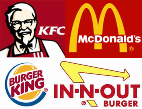
Branding. Red and yellow is used predominately by fast food companies.
You may have noticed, especially in the UK and some countries in Europe McDonalds have changed their city based store colours to green. Notice the different feeling this gives.
When we see green, we feel safe. It feels familiar to us.
When it comes to food, we associate it with eating something that is natural and also environmentally friendly. Is this what McDonalds wants us to think?
Green is also saying you no longer have to rush in for a quick bite to eat. You can relax, get comfortable, linger over a coffee (almost dare I say, a bit like Starbucks).
It would be interesting to know if this has attracted a new 'green' customer base, one that is more environmentally aware...?
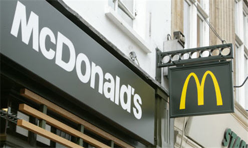
Branding - McDonalds using green giving natural, earthly, wholesome feel.
It's not surprising big brands understand the importance of colour, some going so far as to trademark their brand colours. Branding colours can be that strong only the colour is needed for the brand to be identified.
Thinking about your own branding colours, do you know the reasons you chose them? Perhaps you’ve even let someone else choose them for you arbitrarily? What subconscious messages is your business communicating through the colours you use in your branding?
If you would like to find out more about the power of colour? You'll want to download my free e-book "The 10 Myths that
Limit You using Colour Effectively".
Colourfully yours,
Karen

This is great Karen, very interesting, I never knew that yellow was the most visible colour in daylight! And yeah now that you mention it, it’s true re McDonald’s changing their store colours – wow – I only now just realise this! More and more I am realising the importance of thinking very carefully when it comes to choosing business colours. Great post!
Glad you enjoyed the article. The power of colour is amazing, especially how it works on a psychological level.
Really interesting article. Colors drive emotions and we can utilize this by good color combination and color harmony.
Thanks for sharing.
Hi Yogesh,
Glad you enjoyed the article. It’s really interesting how our emotions can be influenced by the colours that surround us – as you say colour harmony combined with colour combination is so important.
Hi Karen
Great example of how seriously big corporates take colour. Rebranding costs millions and was seen as essential to the suvival of the business.
Would love to hear of your views on what is going on in the use of colour in other business sectors such as petrochemicals or banking who are all in need of an image face lift.
Janet
Thanks for your comments. I think you’ve just given me inspiration for my May newsletter Branding article!
Hi Karen!
What a lovely newsletter and a great feature on colours.
It is so true what you say… I was very careful whilst choosing colours for my branding, having my target audience in mind.
There was a study once that Coca Cola had the impact on people buying it after seeing red in some combinations on films…a subconscious decision. Interesting, isn’t it?
And McDonalds have done their trick, a lot of people who never ate at McDonalds now go, relax and claim it’s healthier. x
Thanks Duda,
glad you enjoyed my April newsletter. The power of colour is endlessly fascinating.
Hi Karen,
This is really interesting! In my old house I painted my dining room red and yellow. It also doubled up as aparty room/dance floor and these colours worked really well with disco lights and smoke machines! 😉
I was very mindful of the the colour that I picked for my business brand and depsite being aware of the meanings, I just LOVE the colour – it just happened that the meanings reinforced what I was about. I like to think that helps to give my brand authenticity. 😉
Thanks for an interesting post!
That’s is interesting… in that situation red is great for energy and yellow for fun. Must haves for a disco!
Great that your brand colours reflect its personality and values. One of the elements to brand authenticity.
Very interesting that McDonalds are changing to green, I’m still not sure I’d like to linger…unless ofcourse they improve the coffee!
It will be interesting to see if this is a company wide change. The golden arches are almost iconic so I’m sure that will stay.
Wow Karen, this is really interesting. I hadn’t noticed red and yellow was such a popular colour combination for fast food chains, and the McDonalds case study is intriguing. I’d love to know if their change in colour has worked – I assume it has…
Thanks for sharing – I’ll be paying more attention to branding and colour in future!
Hi Alicia,
I’m sure you’ll now ‘consciously’ see it everywhere!
That would be an interesting fact. Know anyone who works in the McDonald’s marketing / branding department? 🙂
Hi Karen thanks for this piece of making us know about colour meanings dear its going to help some of us know which colour to be used on or in some particular project thanks a lot dear
Hi Moses,
You’re welcome. You might also like to read the articles on each individual colour which you’ll find in the Tag Cloud.
Enjoy!
Karen 🙂
I always thought McDonald’s chose red and yellow because it’s the colors of ketchup and mustard–which makes you think of hamburgers! It works for me anyway…
Hi Deb,
That’s an interesting association 🙂
Looks like you enjoy eating them 🙂
Karen 🙂
Thank you so much Ms. Karen! You’ve helped me with my report quite a bit… 🙂
Hi Anushka,
you’re welcome.
Karen 🙂