Embrace the feel good power of pink

Karen Haller
Pink is having its moment in the fashion spotlight this season. From palest rose to deep magenta: pink is everywhere we look this spring. I’ve been working with Pink Lady® apples and what a year for pink it’s been so far!
Pink has had a bad rap bad from the some of the press in recent years being blamed for gender stereotyping. However I’ve been championing for years now that pink is loved by men, women and children.
When we see the colour pink it signifies sweetness in food and psychologically we relate it to maternal love. It’s a feel-good, comforting colour that appeals to all humans, male and female, young and old alike.
The confusion arises when we apply social conditions to a particular colour and it becomes something we feel we should view in a particular way. We base our choices on what we think we should do or we follow what everyone else is doing because we‘re worried about being judged, instead of embracing a colour because of how it speaks to us or makes us feel, act and behave. This is social conditioning which we know as colour symbolism or colour in culture.
Colour is much more than that.
Colour is also more than just a visual experience; it influences our feelings, thoughts and behaviours. Established research into theories relating to colour and psychology suggest each colour has specific effects that influence us on all levels; mental, emotional and physical. When we see colours they send unconscious messages in an emotional language that we understand instinctively.
Pink is actually light red. Red is one of the four psychological primaries representing the physical so whilst red is physically stimulating, as a softer, lighter version of red, pink is physically soothing, which is why on the whole we find pink a soothing, calming, gentle hue. Interestingly though bright bubble gum or magenta pinks which are quite intense hues are physically stimulating.
Embrace the feel good power of pink |mrsjonasrecommends instagram
So how do you chose the right tone of pink to use and avoid looking like you’ve given your home or wardrobe styling over to a focus group of four year old girls?
1. Be inspired by the pale, delicate shades of apple blossom if you want to express your softer side.
- Perfect for creating a romantic bedroom
- Looks great teamed with soft green
- Don’t be trapped by gender stereotypes. Use soft pinks as an accent colour in a nursery to give a soothing and comforting feel to the space for a gentle night’s sleep
- The softer pinks such as warm light baby pink, pastel pink and nude pinks along with the blue-based dusty pinks have softer, more feminine, gentle energy – great if you want to soften a minimal domestic space, an edgy outfit or stark workplace.
2. The warm pink tones in a Pink Lady® apple itself are perfect colour references if you want to come across as warm and caring.
- Wear with other soft tones such as apricot, warm ivory white, pale teal or soft greens – perfect if you’re worried about appearing too girly
- Great for warm, yellow-based skin tones
- Soft and natural looking make up shades
- These tones add warmth and luxury to an interior scheme. Think about finding these pink shades in flowers and plants if you don’t want to paint a wall – gorgeous with rose gold, copper and brass as well as dove-grey, slate-blue and bitter-chocolate.
3. The vibrant pink of the Pink Lady® sticker is the lively, feisty magenta. This tone really does make a statement. So if this is the tone for you:
- You’ll stand out in a crowd. It’s perfect for those that want to be seen and get noticed
- In clothing and makeup this is a great pink for strong, assertive, independent women who love the femininity of pink, but feel soft pinks are just aren’t right for them.
- Tones such as magenta and fuchsia communicate more the feisty, strong, feminist side. Women often see this as being their ‘grown up’ version of pink, a more adult version of the softer pinks.
- Use this as an accent colour in the home to bring dynamic energy to any room. Perfect teamed up with pure white, black and silver.
- Look for fun and funky accessories and interesting textures to keep this colour from looking hard
Caution: If this tone of pink doesn’t suit you, you may come across looking hard and unapproachable.
Embrace the feel good power of pink | swallowsanddamsons instagram
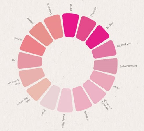
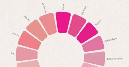
Embrace the feel good power of pink | Pink Lady® apples | pink colour wheel
DID YOU KNOW?
- Hot pink (commonly known as magenta) is actually a cold hue as it’s a blue-based tone
- Pink wasn’t marketed to girls until the 1940’s when a US department store ran a marketing campaign where they switched to blue for boys and pink for girls. The campaign became so successful that it stuck. Manufacturers caught on and started making toys, clothes etc. almost exclusively in pink for girls and blue for boys
- Pink is the colour of romantic love whereas red is the colour that represents passion and lust. Interesting that men give red flowers for Valentine’s Day – now you know what they’re really saying…
So, 2016 might have taken on a rosy hue, but is it time to fall back in love with the colour and embrace the power of pink to lift our mood and make us feel better.
I’d love to know your relationship with pink? Do you have a favourite tone of pink?
Karen x
Images courtesy of:
Pink Lady® apples
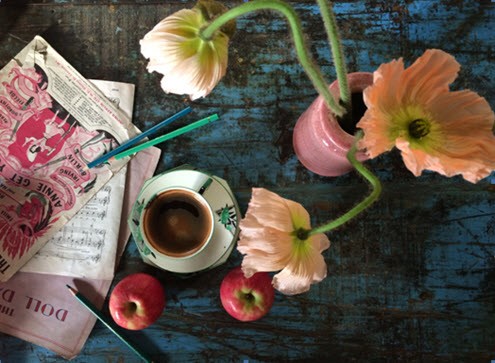
mrsjonasrecommends
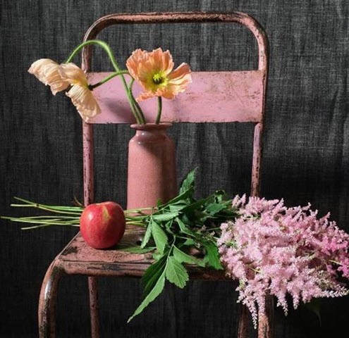
swallowsanddamsons